CSS Flexboxでjustify-contentを使いこなす!中央・端・均等配置の方法を初心者向け解説

生徒
「先生、Flexboxで要素を中央や端に揃えたいんですけど、どうやればいいですか?」
先生
「その場合は、justify-contentというプロパティを使います。Flexboxでは、横方向の配置を簡単にコントロールできるんです。」
生徒
「横方向だけですか?例えばボタンを中央に並べたいときとかも使えるんですか?」
先生
「はい、中央揃えも、左右端に揃えることも、均等に間隔を空けることもjustify-contentでできます。それぞれの使い方を見ていきましょう。」
1. justify-contentとは何か?

justify-contentは、Flexboxで親要素(フレックスコンテナ)内の子要素(フレックスアイテム)を横方向に整列させるためのCSSプロパティです。例えば、ボタンやアイコンを中央に揃えたいときや、両端に揃えて隙間を作りたいときに使います。横方向の位置をコントロールするため、画面の幅が変わっても自動的に整列してくれるので便利です。
2. justify-contentの基本的な値

justify-contentには主に次のような値があります。
- flex-start:左端に揃える
- flex-end:右端に揃える
- center:中央に揃える
- space-between:要素間を均等に配置(両端は端に固定)
- space-around:要素の周囲に均等な空間を作る
- space-evenly:要素間も端も均等に配置
この値を変えるだけで、簡単に横方向の配置を自由に調整できます。
3. justify-contentで中央揃えをする方法

Flexboxで要素を横方向に中央揃えしたいときは、justify-contentにcenterを指定します。例えばボタンを中央に並べたいときに使います。
<style>
.center-container {
    display: flex;
    justify-content: center; /* 横方向中央揃え */
    background-color: #f0f0f0;
    height: 100px;
    align-items: center; /* 縦方向も中央揃え */
}
.center-item {
    width: 50px;
    height: 50px;
    background-color: #e74c3c;
    color: white;
    display: flex;
    justify-content: center;
    align-items: center;
}
</style>

<div class="center-container">
    <div class="center-item">A</div>
    <div class="center-item">B</div>
    <div class="center-item">C</div>
</div>
このように、子要素が親要素の横幅に対して中央に揃います。
4. justify-contentで端に揃える方法

左端に揃えたい場合はflex-start、右端に揃えたい場合はflex-endを指定します。
<style>
.edge-container {
    display: flex;
    justify-content: space-between; /* 両端に揃える */
    background-color: #f9f9f9;
    height: 100px;
    align-items: center;
}
.edge-item {
    width: 50px;
    height: 50px;
    background-color: #2ecc71;
    color: white;
    display: flex;
    justify-content: center;
    align-items: center;
}
</style>

<div class="edge-container">
    <div class="edge-item">A</div>
    <div class="edge-item">B</div>
    <div class="edge-item">C</div>
</div>
space-betweenを使うと、両端に要素が揃い、間隔が自動で均等に調整されます。
5. 均等配置の応用

space-aroundやspace-evenlyを使うと、要素の間隔を均等に揃えることができます。space-aroundは要素の周囲に同じスペースを作り、space-evenlyは端と要素間も均等に配置されます。これにより、見た目のバランスが良いレイアウトが簡単に作れます。
<style>
.equal-container {
    display: flex;
    justify-content: space-evenly; /* 均等配置 */
    background-color: #f7f7f7;
    height: 100px;
    align-items: center;
}
.equal-item {
    width: 50px;
    height: 50px;
    background-color: #9b59b6;
    color: white;
    display: flex;
    justify-content: center;
    align-items: center;
}
</style>

<div class="equal-container">
    <div class="equal-item">A</div>
    <div class="equal-item">B</div>
    <div class="equal-item">C</div>
</div>
このように、子要素の間隔が均等になり、画面サイズが変わってもバランスが崩れません。
6. justify-contentを覚えるコツ

初心者はまず、中央揃えcenter、両端揃えspace-between、均等配置space-evenlyを覚えると便利です。Flexboxは画面サイズに応じて自動で整列できるので、ナビゲーションバーやボタンの配置など日常的なWebデザインにすぐ役立ちます。慣れてきたら、flex-startやflex-end、space-aroundも使ってより細かい調整を覚えましょう。
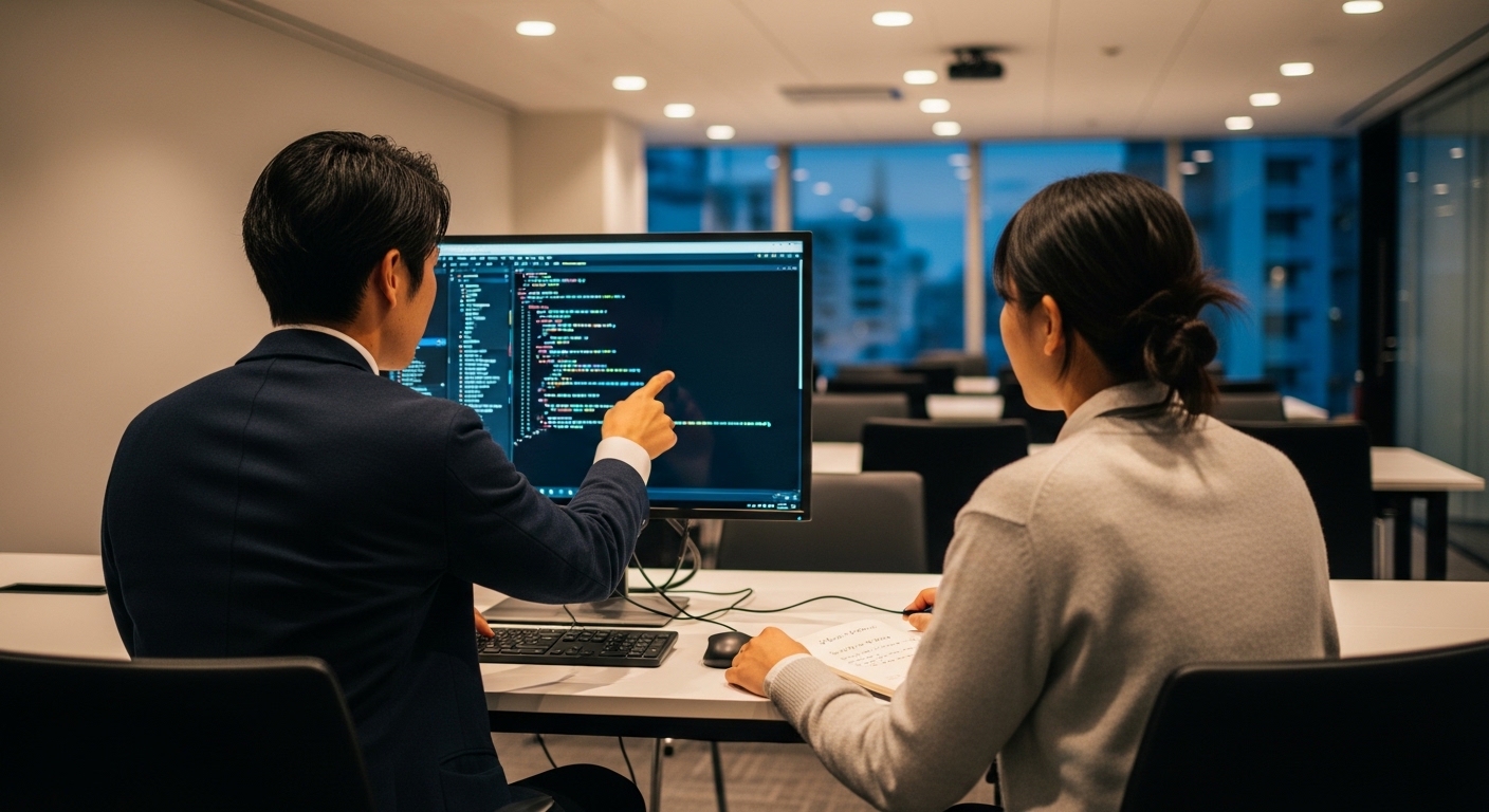
【60分集中】Flexboxを完全攻略!最新CSS3で「崩れない・迷わない」モダンUI構築セミナー
「魅せる力」をコードで実現。CSS3でモダンWebデザインのプロトタイピングを。
本講座では、単に色を変えるだけではなく、「ユーザーを迷わせないUIデザイン」と「崩れないレイアウト設計」の本質を学びます。最新のCSS3とモダンなレイアウト手法を通じて、プロの現場で通用する「美しさと機能性を両立した実装力」を最短距離で習得します。
具体的なワークショップ内容と環境
【つくるもの】
HTMLで作成した骨組みに対し、商用サイトでも採用される「スタイリッシュなカード型UI」や「レスポンシブなナビゲーション」を構築します。色の選定基準や余白(ホワイトスペース)の黄金比など、デザインの理論をコードに落とし込む工程を体験してください。
【開発環境】
フロントエンド開発の標準であるVisual Studio Code (VS Code)を継続使用。CSSの記述を効率化するプラグインや、ブラウザのデベロッパーツール(検証機能)を駆使して、リアルタイムでデザインを微調整するプロのワークフローを再現します。
この60分で得られる3つの技術資産
要素の横並びや中央揃えを自由自在に操り、どんなデバイスでも崩れないレスポンシブな配置術を完全理解します。
後から修正しやすい「壊れにくいコード」の書き方を伝授。プロの現場で必須となる命名規則の考え方を学びます。
画像の最適化や軽量な装飾技法など、ページの表示速度を落とさずに高級感のある演出を行うテクニックを習得します。
※本講座は、HTMLの基礎を終えた後のステップアップ講座です。Webデザイナー、UIデザイナー、フロントエンドエンジニアへの道を切り開く「魅せる技術」を、モクモク独自のパーソナル指導で着実に定着させます。
リラックスしながら、学ぶことが大切です。しっかりと基礎を理解しましょう!
各回少人数・マンツーマン形式で徹底サポート
このセミナーの詳細・お申し込みはこちら


